[expand title=”What is single variable data and how can we represent it visually?”]
Create the following plots for our data set. Each must include a title, labels, and scales.
- Dot Plot
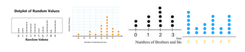
- Histogram
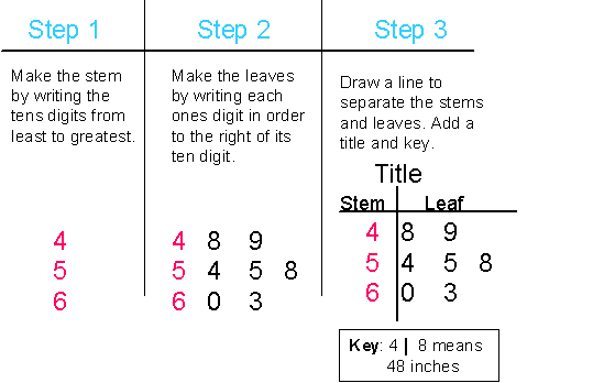
- Stem and Leaf (Khan Academy)
Assignment: Find your own data set of about 25 values and create plots
- Page 1: description of your data set and list of values
- One page each for dot plot, histogram, and stem and leaf plots
[/expand]
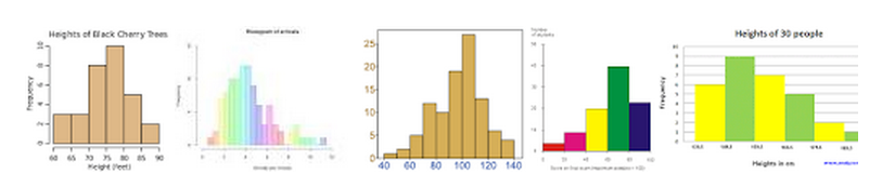
[expand title=”What does its shape tell us?”]
Normal. A common pattern is the bell–shaped curve known as the “normal distribution.” In a normal distribution, points are as likely to occur on one side of the average as on the other.

Skewed. The skewed distribution is asymmetrical because a natural limit prevents outcomes on one side. The distribution’s peak is off center toward the limit and a tail stretches away from it. For example, a distribution of analyses of a very pure product would be skewed, because the product cannot be more than 100 percent pure. Other examples of natural limits are holes that cannot be smaller than the diameter of the drill bit. These distributions are called right – or left–skewed according to the direction of the tail.

Double-peaked or bimodal. The bimodal distribution looks like the back of a two-humped camel. The outcomes of two processes with different distributions are combined in one set of data. For example, a distribution of production data from a two-shift operation might be bimodal, if each shift produces a different distribution of results. Stratification often reveals this problem.

Plateau. The plateau might be called a “multimodal distribution.” Several processes with normal distributions are combined. Because there are many peaks close together, the top of the distribution resembles a plateau.

Edge peak. The edge peak distribution looks like the normal distribution except that it has a large peak at one tail. Usually this is caused by faulty construction of the histogram, with data lumped together into a group labeled “greater than…”

Comb. In a comb distribution, the bars are alternately tall and short. This distribution often results from rounded-off data and/or an incorrectly constructed histogram. For example, temperature data rounded off to the nearest 0.2 degree would show a comb shape if the bar width for the histogram were 0.1 degree.

Truncated or heart-cut. The truncated distribution looks like a normal distribution with the tails cut off. The supplier might be producing a normal distribution of material and then relying on inspection to separate what is within specification limits from what is out of spec. The resulting shipments to the customer from inside the specifications are the heart cut.

Dog food. The dog food distribution is missing something—results near the average. If a customer receives this kind of distribution, someone else is receiving a heart cut, and the customer is left with the “dog food,” the odds and ends left over after the master’s meal. Even though what the customer receives is within specifications, the product falls into two clusters: one near the upper specification limit and one near the lower specification limit. This variation often causes problems in the customer’s process.

Excerpted from Nancy R. Tague’s The Quality Toolbox, Second Edition, ASQ Quality Press, 2004, pages 292–299.
Use student created graphs of data to discuss the shape of the data
[/expand]
[expand title=”Focus on center, spread, and outliers”]
Today will focus on measures of center (or central tendency)
Using the following data for salaries from a small company:
100, 100, 100, 100, 100, 120, 120, 130, 130, 4000
- Calculate the mean
- Does it accurately or fairly represent the data?
- Calculate the median
- Does it accurately or fairly represent the data?
- Calculate the mode
- Does it accurately or fairly represent the data?
Does the mean or median better represent our data?
- With data that is strongly skewed (not symmetric), it is most appropriate to use the median.
- With data that is symmetric, it is most appropriate to use the mean
Quartiles
Sometimes it is helpful to divide the data into fourths. We find the center by finding the median, then find the “centers” of each half.
- Find the median
- Find the median of the left half and the median of the right half
We can them use a box and whisker plot to represent this data
Box and whisker plot
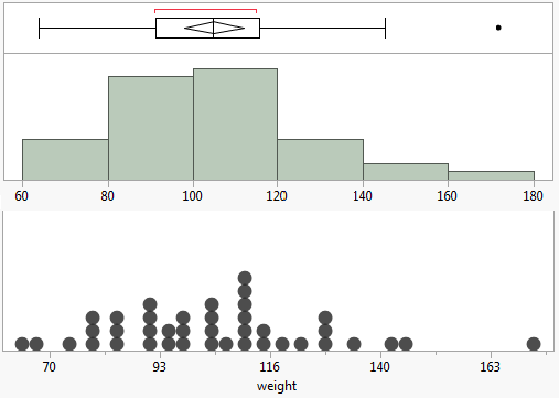
Assignment: Create a box and whisker plot for your Marshmallow Challenge data set
Interquartile Range (IQR)
The interquartile range is a measure of the middle half of the data set. it starts at the lower quartile (Q1) lower and ends at the upper quartile (Q3). It is the range defined by the difference between Q3 and Q1.
Outliers
Outliers are data points that are greater than 1.5IQR above Q3 or 1.5IQR below Q1. They are found by multiplying the interquartile range by 1.5 and either adding it to Q3 or subtracting it from Q1. Values outside of this range are outliers.
Find the IQR and outliers for the example data set:
100, 100, 100, 100, 100, 120, 120, 130, 130, 4000
Assignment: Find the IQR and Outliers for your Marshmallow Challenge data set
[/expand]
[expand title=”Review Data set”]
[/expand]
[expand title=”Single Variable Final Write Up”]
Your packet should have the following:
- Dot plot
- Histogram
- Stem and Leaf
- Box plot
- Measures of center and Outliers
Final analysis of data
- Claim: What is the center and what does it mean?
- Support your claim with a plot (your choice) and reasoning
[/expand]